This document is a draft specification for the manipulation of multiple flows of content in paged-media, and was written as part of the Écran-Papier-Éditer project. This specification and paged.js implemtantion is made by @julientaq and the result can be found on CSS Print Lab’s github. Paged.js implentation is show on pagedjs.website: https://pagedjs.org/posts/en/parallel-flows-within-paged.js.
This specification defines new CSS properties and concepts to enable parallel content flows within paged or multi-column layouts, primarily in the context of paged media. Parallel flows allow multiple independent streams of content (e.g., different languages, versions, or perspectives) to occupy the same or adjacent pages in a synchronized, visually parallel manner.
These properties are designed for integration with Paged.js and similar layout engines, and extend the traditional single-flow CSS model toward multi-stream page composition.
While CSS-grid or flex can offer some of the features needed, having the possibility to go beyond the grid is an important need for paged-media and print.
CSS has traditionally represented content as a single, continuous flow—a downward, linear progression of elements within a scrollable or paginated environment. While CSS Grid and Flexbox introduced two-dimensional layout capabilities, they remain limited to positioning and cannot fragment content across multiple, independent streams.
The CSS Parallel Flows Module introduces a mechanism for defining multiple coordinated flows, each representing an independent content stream, that may coexist within a shared page or spread.
This feature was initially explored through the now-deprecated CSS Regions specification. The Parallel Flows model revisits these ideas with modern layout paradigms, building on concepts from Paged.js, print CSS, and experimental digital book layout.
The Riddle, a good use case for parallel-flows, a book designed by the people of Open Source Publishing
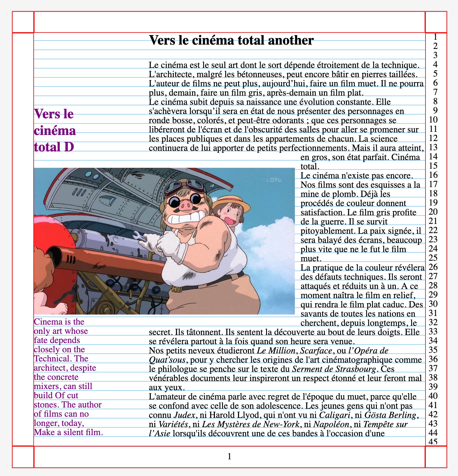
Only Revolution, by Mark Z. Danielewsky, using different flows of text, even turning texts upside down.
Parallel Flow:
A named group of elements that are laid out concurrently with other flows within a shared page or spread.
Main Flow:
The longest or primary flow in a set of parallel flows; determines pagination and synchronizes subordinate flows.
Secondary Flow:
A flow that aligns with a main flow but is positioned independently, typically within the same page or adjacent page.
Spread:
A pair of facing pages displayed together (as in printed books or magazines).
right now, the Main Flow is defined by the system, but it would make sense if the author could in the CSS directly.
parallel-flowName: parallel-flow
Value: <identifier>
Initial: none
Applies to: all elements
Inherited: no
Defines the name of the parallel flow to which the element belongs.
All elements with the same parallel-flow value are treated as part of the same flow group and are laid out concurrently.
In this example, the section#alpha and the section#beta will share the same parallel flow.
Example:
css

#alpha {
    /* setting the named flow for the selector */
    parallel-flow: hand;

    /* the localisation of the content on the page */
    width: 30%;

}

#beta {

    /* setting the named flow for the selector */
    parallel-flow: hand;

      /* the localisation of the content on the page*/
    width: 65%;
    margin-left: auto;
}


#epsilon {
    parallel-flow: else;
    width: 45%;
}

#delta {
    parallel-flow: else;
    width: 45%;
    margin-left: auto;
}`
In the above example, the flows hand and else are defined.
Elements within each group (#alpha with #beta, and #epsilon with #delta) share synchronized pagination.
parallel-impactName: parallel-impact
Value: none | all
Initial: none
Inherited: no
Specifies whether an element within a main flow can influence the layout of secondary flows.
When set to all, spatial elements (e.g., images or floats) may cause corresponding layout adjustments in secondary flows.
Example:
css

#porco {
    parallel-impact: all;
}
Note:
Theparallel-impactproperty only applies when the impacting element exists in the main flow. Secondary flows are positioned after the main flow layout is determined.
parallel-syncName: parallel-sync
Value: <identifier>
Initial: none
Inherited: no
Defines synchronization points between flows. Elements with matching sync identifiers in different flows will begin on the same page (or spread), aligning their start positions.
Example:
css


.en, .fr {
     parallel-flow: alpha;
}

h3 {
     parallel-sync: alpha;
}
This ensures that headings in .en and .fr flows begin simultaneously within their respective parallel flow segments.
Browser and similar engines may expose configuration options for managing flow relationships with a javascript API.
This could also be defined using css properties.
I’d like to have some feedback from the CSSPrint folks, to push a bit the different possibilities: should we have a --flow-definition rule?
or should we define the type of flow in the main parallel-flow?
js

this.flowLocation = "samepage" | "samespread";
this.flowSpreadAddWhite = true | false;
samepage: Flows share the same physical page.
samespread: Flows occupy opposite sides of a spread.
flowSpreadAddWhite: Automatically inserts a blank page to balance uneven flow lengths.
The layout engine identifies all flow groups via parallel-flow.
For each group:
The longest flow is designated as the main flow.
Secondary flows are laid out concurrently or on adjacent pages.
When making pages, the engine will create a new page following the specifications for @page-media. If a parallel flow is found, the main flow will be added on the page before all the other flows.
When all the element of the flows that fits on the page are drawn, the layout of the page is considered finished and the engine can move to the next one.
Multilingual publications: Presenting multiple languages side-by-side.
Scholarly editions: Aligning commentary and translation streams.
Design prototyping: Visual comparison of content versions.
Parallel narrative layouts: Storyline comparison or dual-perspective design.
same-page, same-spread);@flow at-rule inside a @page declaration? This could work as a @page, using named-flow and it will give us some more control on the page layout from the container and not from the content? (just like css-grid works)User agents that claim conformance to this specification must implement the properties defined herein and ensure correct rendering of parallel flow synchronization and layout relationships.
This specification draws inspiration from the discontinued CSS Regions module and builds upon experimental work in Paged.js by the open-source and typographic communities, including Open Source Publishing and the Ècran-Papier-Éditer (EPE) project of ESAD Grenoble-Valence.